


Premium ParkingPolishing the parking purchase funnel in mobile apps
- Timeframe
Feb 2018-Jun 2019 - Role
Lead Product Designer - Responsibilities
Research, UX design, Usability testing, Data Analysis - Team
Director of Product Experience, CPO, Lead Product Designer (me), Development Team Lead, 2 Back-end Engineers, Project Manager, 2 iOS Developers, 2 Android Developers
Premium Parking is digital parking solution in the US, with over 500 employees and $105.7M in annual revenue.
My role and the teamEating your own dog food
After the successful launch of the Business Account, I was involved in the redesigning of mobile apps. I worked as a product designer, embedded on the mobile development team with a handful of engineers, some PM folks, and C-level executives. C-Level executives are loyal app users with a long history.
I have participated in all workshops and user testing sessions. I also took part in summarizing insights and crafting high fidelity mockups to help implement potential solutions through design ideation, iteration, and prototyping.
Challenges and goalsOur clients success is our success
As a team, our mandate was simple: do whatever we could as a company to make it easier to pay for parking and not be booted. One more thing from Company President: "We also would like to lighten up the color scheme and overall feel."
View Results
Historical context


Picking up the pieces
We looked into what currently existed and aimed to better understand what our end customers were currently doing and why.
Before investigating, we realized that flurry does not track all necessary events. So, we prepared a list of necessary events to track better user behavior.
I looked at many different points of data — qualitative and quantitative (flurry events) from internal sources, and the most frequent issues from support. Also, on the App Store, we found two reviews with a 1-star rating. Customer's car was stolen, another one scratched :(
All team members installed staging apps, and we created parking in our cities. So, we started using the parking app to share our own experiences.
DefineGoals of the redesign
- Flurry events showed us:
- Search is the most popular action
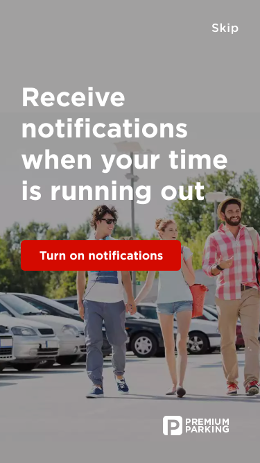
- Most of customers with disabled push notifications
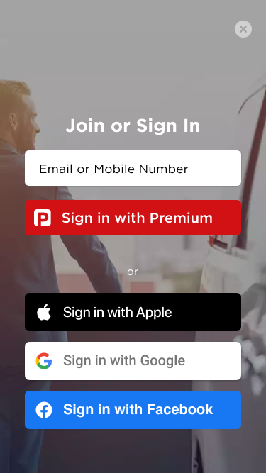
- Auth problem for customers who previously paid in TextPay
- Checkout Abandonment (money went to enforcement)
- Low MAU/DAU
From support.
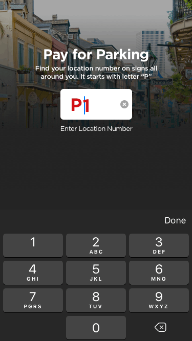
Customers made mistakes with parking numbers. Signup issue for customers who previously paid in TextPay.
Our expert feedback.
The app had issues with feedback. The application used non-standard controls that people did not understand how to use. No convenient payment methods
Other.
You need to try to increase the number of positive reviews in the App Store and Google Play Market.
After estimate-sessions with the dev team, we realized that fixing all issues in the app may take months.
So we started with "low hanging fruits" that could make it easier to pay and reduce refunds. We decided to make some of the features in the old application to evaluate their effect.
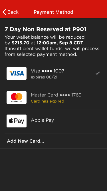
- Add ability to pay via Apple/Android Pay
- Fix dead-end scenarios on the payment screen
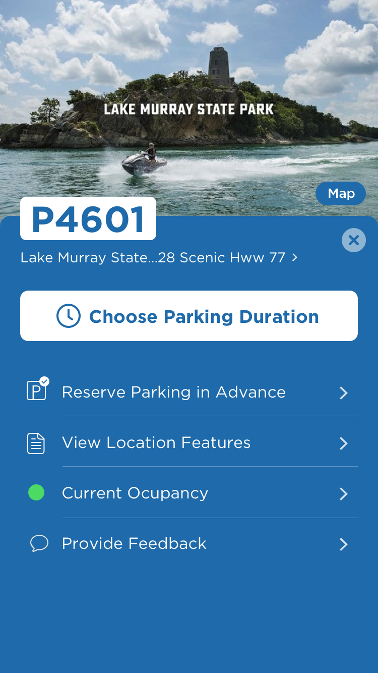
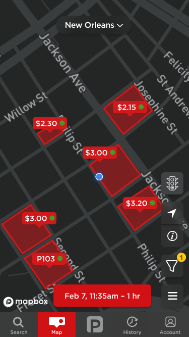
- Show list of nearby parking lots
- Fix auth in mobile apps for textpay customers
The biggest change in rates grid.
Almost each location has rates for 1, 2, 4, 8, 12, 24 hours. The main idea was to allow customers to choose any parking duration. Rate calculation logic: If the client has chosen 6 hours, then they pay for 8, because we didn't have a 6-hour rate. It might increase revenue. We decided to try this.
To increase the app's rate, we decided to split asking for reviews in two steps. At first, the app asked for a rating, and then, if the rating was above 4, we sent it to the app store. In other cases, we collected reviews in "delighted" for further improvements. In some cases, support contacted with customers to help.
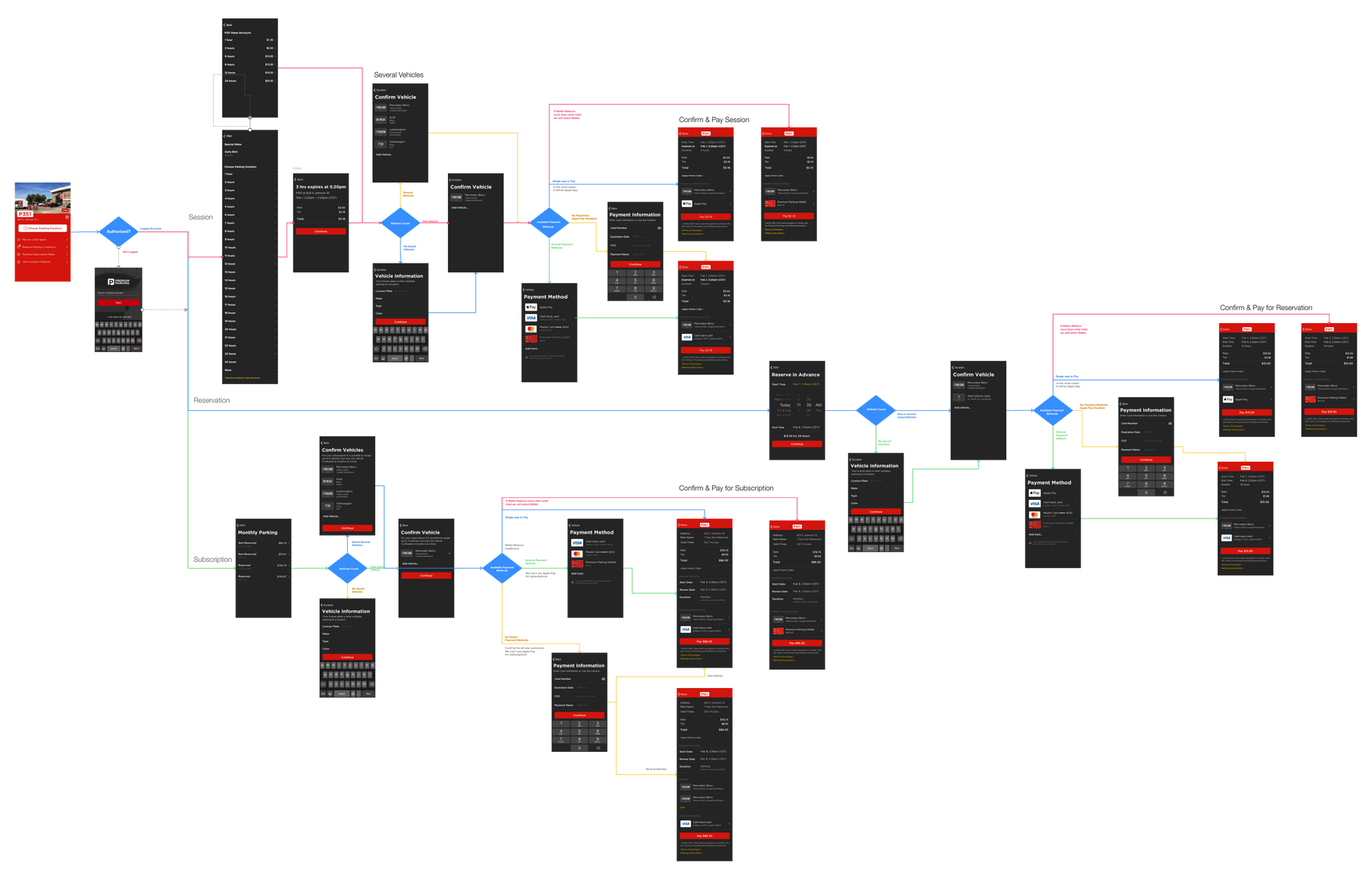
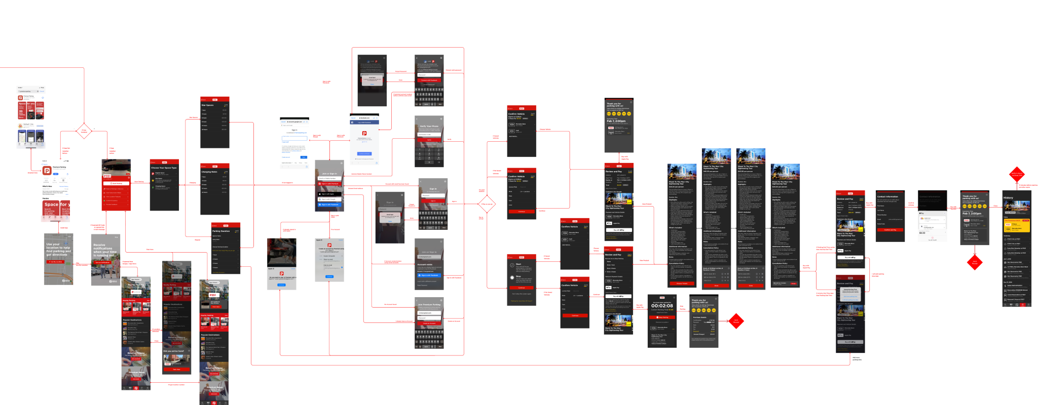
Designing the solution
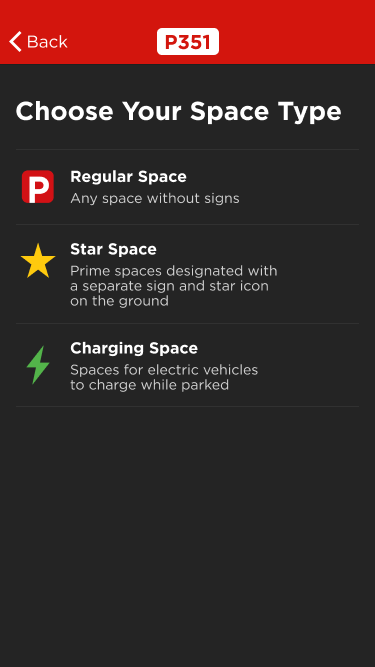
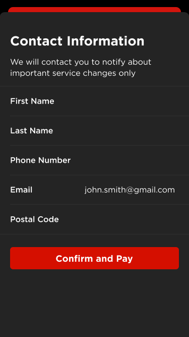
I've replaced all custom (non-obvious) controls with native as much as it was possible for each platform. I redesigned the entire checkout flow, the location page, and added onboarding. To maintain consistency and provide an efficient handover, I extracted reusable components and their states into a library. For example: cards, list items, controls, button, location numbers, and others. It started with Sketch, later transferred to Figma. Every component can be rearranged and combined with others while maintaining design consistency and recognizable UI patterns for the user. Subscriptions were ready on the web-app and back-end side, so we could plan it for upcoming releases. Subscriptions required more information about Parker, so had a different checkout flow.


Validate the prototypes
Since the changes were quite significant, it was impossible to do without usability tests. I built a prototype in FramerJS with price calculation logic.
We feared that the new checkout first experience would cause issues because it was more friction and a fundamentally different flow. To our surprise, not a single participant noticed the different sequencing of the flow or had trouble with it.
- Things that tested and worked:
- Navigation became clearer. No lost context
- The new checkout flow fixed cases with no license plate number
- No misunderstandings with the list of durations.
- Location detection saves time
- Things to improve:
- Onboarding should be shorter
- Handle case if no network connection (underground parking)
Refine and iterate
We launched a rates experiment only at one location (the growth in revenue was noticeable), then it was enabled at all locations. But then we realized that it does not work well everywhere. So, we turned the updated rates grid into a location setting that can be turned on/off.
Results
A well-organized and flexible application with a design system allowed us to quickly design and connect new integrations and functionality in the future (travel, insurance, data providers).
- Conversion to purchase increased by 5.68%
- DAU increased by 2 times and still growing
- Review Rate went up from 2.3 to 4.5