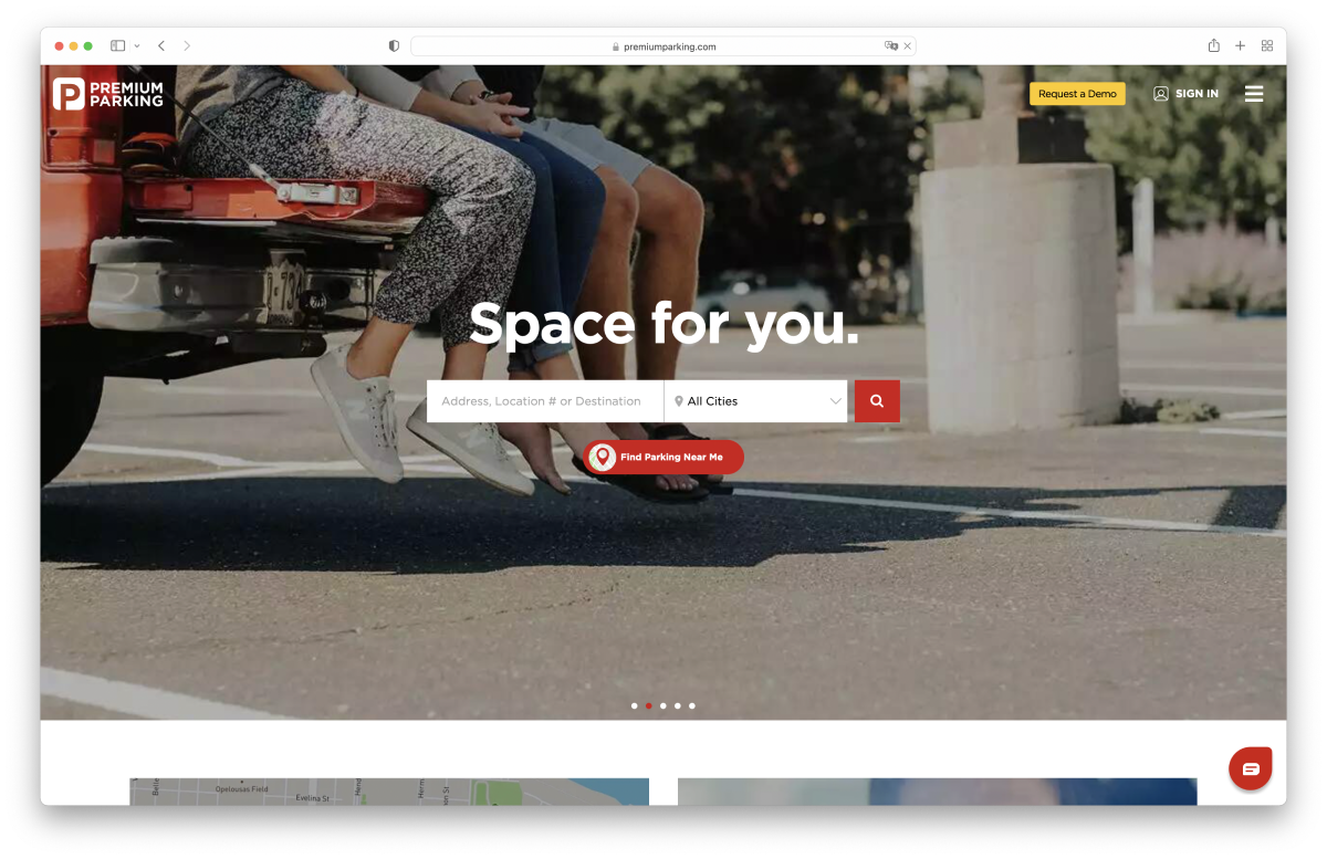
Premium ParkingA full rebrand of Premium Parking, including the new design system
- Timeframe
Jul 2019-Mar 2020 - Role
Lead Product Designer
Premium Parking is digital parking solution in the US, with over 500 employees and $105.7M in annual revenue.
During my work on mobile apps, I proposed designing a new brand identity. Premium Parking has decided to invest in the brand to strengthen its premium position. The new look will bring consistency to existing and new products (amount grew) and a distinctive personality to Premium's assets.
View Results
Historical context


De-risking of the changes
Our goal was to coordinate the launch across web, platform and mobile apps and offline signs, so that a customer who parked vehicle recognize the brand at all steps. Especially when the Premium collaborated with other brands.
On the web app, we wanted to use the same checkout workflow as on mobile apps, which I designed during redesigning mobile apps. Also, the marketing team asked for a tool for building custom landing pages. For the other products, we wanted to maintain the existing functionality, but as much as possible. We were focused on updating the aesthetics instead of totally rethinking the way things worked. We also wanted to guarantee that the new design system met AA accessibility standards from the start.
Smooth collaboration
For these big changes, Premium Parking hired a US-based SouthLeft agency. SouthLeft worked on logo, color scheme, and offline materials. Also, it was my collaborative work with Southleft on the Design System and Web-app.


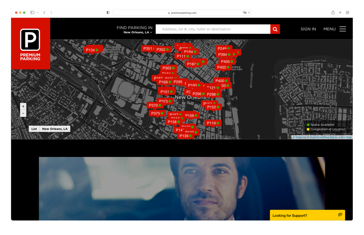
Applying the rebrand and redesign the website
We used all our learnings from other products to improve the rates and location pages. This included making sure they matched our users' mental models and could grow like the mobile apps. To keep the conversion rate on the same level, we decided to test updates on a wider audience. So, we prepared A/B with Conversion Rate to purchase as primary metric and Click-Through Rate as secondary. We ran an A/B test for a new location page to test how it converts new users to make a reservation vs. old location pages.


We used Sketch until I started working on mobile apps. The rebrand felt like a good time to give Figma a spin, especially since Figma had deeper integrations with the front-end.
While we were in the middle of refreshing the branding and design, the engineering team had been working on changing the tech-stack.
The site was riddled with tech debt from a slow move from Bootstrap and page-specific CSS to more modular CSS. In short, the platform was extremely difficult to work on and was connected to other apps. The rebranding presented the engineering team with the perfect opportunity to start over completely. We decided to launch the rebranding on a brand new tech-stack and extract from the core app. The NextJS-based web-app with the Atomic Design System helped us to better connect new integrations.


Positive results and much more to do
The redesign of the checkout flow in the web app didn't have a negative short-term impact and had a positive long-term impact after launch. Redesign the web-app unlocked for us more opportunities for collaborations and integrations.
The Design System has had a big impact on how designers and engineers build features at Premium Parking. I can say this with confidence two years later.
- It’s easier for designers and engineers to collaborate, since they now have a common language (and design language) to do so.
- Engineers can make a lot of progress when building a feature without as much design oversight.
- It's sped up feature development time by an order of magnitude, since it almost defeats new code writing
- Designers now have the space to focus on customer problems, product strategy, and user flows.